Showing posts with label Self Directed. Show all posts

Thursday, 1 May 2014

Self Directed Canvases (and Robert Rauschenberg)


Untitled
Acrylic, White Emulsion and Collage Materials
100x100cm Canvas


Untitled
Acrylic, White Emulsion and Collage Materials
100x100cm Canvas

I decided to apply the colour/line composition onto a larger scale. I knew by this point that I had become quite bogged down in colour theory and needed to bring back some of the playfulness which was a part of my initial paintings. To do this I sought to loosen the way I applied paint, I took inspiration from Hitchens in this aspect more so than Klee, but at the same time retaining all that i'd learnt from Klee's colour theory.

First Canvas: The placement of the colours for this piece have been directly influenced by my 'colour and line' composition; though I have used a much looser approach in terms of application of paint. I used various collage items (including a piece of wood, fabric, tape, magazine paper, a slide, cardboard and the palette I used) on top of this. I chose to add collage on top to make the painting become more 3 dimensional and to add depth. I have even cut a hole in the canvas and strung fabric a few centimeters behind so that the sense of depth became even more apparent. I didn't want it to be about the objects i'd stuck on though, I wanted to implement them in a way that it keeps focus on their colour rather than objectifying them.

Second Canvas: I chose to create a composition much more loosely based on the composition ideas than I had with the first canvas. I still used some of those ideas, but I improvised and re arranged them on the canvas itself rather than before hand. I painted the lines white, so that the colours on the rest of the painting became lighter than my previous canvas - which had black lines. This shows how line and colour have an influence each other. I used collage for this piece too.

Whilst painting these canvases I became aware that certain aspects had a resemblance to some of the work of Robert Rauschenberg. I can see that it is mainly the seemingly arbitrary choice of mixed media, but with closer inspection they are there for either colour or composition reasons. My use of painted fabric could have been subconsciously influenced by Rauschenberg's 'Bed' from 1955. As you can see from his piece 'Charlene' which is one from his 'Combines' series of 1954, the whole composition is formed from found objects.

[IMG_0538.JPG]

'Bed' from 1955.

RauschenbergCharlene.jpg

Charlene, 1954, Combine painting.


Self Directed Statement

My self-directed project is a continuation from my first term project in which I am studying the urban environment, particularly the varying structures that form the landscape. In my initial paintings I wanted to emphasise certain structural elements of the subject, but also to retain a sense of ambiguity to these paintings. I did this by rapidly painting the outline with a large brush and then highlighting certain sections with thick black Franz Kline-esque lines. I started paying closer attention to my use of colour and begun painting some sections with blocks of colour, with tones more carefully considered than in previous pieces. I was recommended by my Self- Directed tutors to look at Paul Klee and Ivor Hitchens’ studies of landscapes and their use of colour in these. I started becoming more interested in how the colour tones and black lines create a sense of space and where they sit in the painting in relation to one another. In order to move the project forward I decided to see what happened when I isolated the thick black lines from the paintings and re adjusted them around.This process was a way of further abstracting any outcomes which came from this process. Paul Klee became my main source of inspiration once I read 'Klee - On Modern Art'. Klee writes about the creative process of creating a painting, which he believes begins in the subconscious. Klee then goes on to talk about the different dimensions which artists consider while painting - line, tone, value, colour. I began thinking about these dimensions in much greater depth than I had in my previous paintings. I had discovered that each choice of colour changes all subsequent blocks, I saw this as meaning the outcome is continually being rewritten. For each block, I had considered the size of the block, judged in relation to the size of other blocks' sizes. I had also considered the form of each block - the line has influence on this. Additionally, I began considering my choice in colour too, which has been judged in relation to neighboring blocks. I spent time on Photoshop, experimenting to see what happened when I inverted the thick black lines on my A4 paintings to white, in most cases it completely transformed the painting by allowing more focus to be had on the colour rather than line.  Having worked extensively on trying to create a composition with worked harmoniously in terms of line and colour, I decided to see how the compositions looked on a larger scale (100x100cm canvas paintings). I knew by this point that I had become rather bogged down in colour theory and needed to bring back some of the playfulness which was a part of my initial paintings. To do this I sought to loosen the way I applied paint, I took inspiration from Hitchens in this aspect more so than Klee, but at the same time retaining all that i'd learnt from Klee's colour theory. 

Paul Klee


Paul Klee,  Maibild (May Picture), 1925. Oil on cardboard nailed to wood with original strip frame. 16 3/8 x 19 1/2 in. (41.6 x 49.5 cm)


Exercise from Paul Klee’s Colour Class, 1925

Paul Klee was a German-Swiss painter, who is considered to be one of the most highly influential figures of early 20th century Expressionism. Klee is most notable for his many abstract paintings focussing on colour and form, and his colour theory writings are considered hugely important. Klee’s art theories are well documented. In Pedagogical Sketchbook (1925), one of his several important essays on art theory, Klee tried to define and analyse the primary visual elements and the ways in which they could be applied. Klee gave a series of lectures on his colour theories at the Bauhaus between 1921 and 1931. His aim was to teach the foundations of colour and form to the students with a series of exercises. These unconventional exercises included a six-part rainbow shaped into a colour wheel. Klee set about seeking alternative ways in which to hold his paintings together visually. A benefit of utilizing small selections of colours was that the resulting impression appeared unified and harmonious. A significant aim was to translate simple colour exercise to the complex work of art.  His strategy was not only to integrate drawing and painting, but also with considerations of form, composition and content.

Klee’s visited Tunisia, where he was inspired by the colours and the light he saw there. From this experience Klee created his first abstract piece, ‘In the Style of Kairouan’. The coloured rectangles became his basic building blocks. I have been particularly interested in the way  Klee combined these blocks with a harmony which draws parallels to musical compositions. His selection of colour is very considered, using complementary pairs of colours as well as dissonant colours – much like in music where you find harmonious notes contrasted with dissonant ones. Some of Klee’s later works were noticeably darker with thick lines and fewer colours. He was diagnosed with Scleroderma, a wasting disease, in 1933. Which from therein limited his productivity as an artist. In 1937 Adolf Hitler and the Nazis deemed his work as ‘Degenerate Art’, seizing 102 of his public collection.


Ivor Hitchens


Damp Autumn (1941)
Oil on Canvas
406 x 743 mm


Ivor Hitchens (1893 -1979) was an English painter best known for being a part of the artists circle known as the 'London Group'. I was recommended to take a look at his work by my Self Directed tutors. Hitchens neither painted landscape as a detached observer, nor did he abstract forms from nature, and he valued the disciplines of Cézanne too highly to allow structure to be controlled by subjective response alone. I am particularly interested in Hitchens' use of colour - though his work lies between abstract and figurative he has used different tones to provide a sense of depth. Looking at his 1941 piece 'Damp Autumn' you can see that he has not used a wide range of colours but a limited palette with subtle changes in tone - which I think gives an effective sense of depth. Unlike much of Klee's work - another artist i'm studying - Hitchens' has applied the paint in a loose but still figurative way.

Paintings Photoshop edited


Photoshop Edited Paintings

I wondered if the black lines of the paintings were too overbearing over the colour. So I decided to invert the black to white using Photoshop. By doing this the paintings have been significantly transformed, to me they feel more vacant than the originals, but it does draw more attention to the background colours.

Self Directed Colour Study Photoshop Edited

I created these Photoshop-edited versions of the colour study painting. I did this to see if adding colour to the white sections added to the painting - and if so what arrangement of colour worked. In the first image I added the colour which surrounded the white sections, I felt that this worked however it seemed like the safe option which I kind of knew would work. For the second image down I have used colours which are the opposites (in terms of colour wheel) to the surrounding colours, I didn't feel this worked particularly well as it didn't go with the rest of the painting which has a harmoniousness about it. For the third image down I wanted to see what happened if used the same colour for each of these sections, this also did not work as it somewhat flattened the image. For the forth image down I used a tool on Photoshop which allowed me to take sections from the main colour blocks and draw them into the gaps. I took sections which were from opposite sides of the painting (same for fifth image),  I felt that this brought the painting together more, making it feel much more whole and complete. 


Self Directed : Colour Study Painting


Untitled, Acrylic on Cartridge Paper, 30x20cm

I have recently been very interested in Paul Klee's theories which I have discovered since reading 'Klee on Modern art'. The sections where Klee writes about the creative process of creating a painting, which he believes begins in the subconscious - was of great interest to me. Klee then goes on to talk about the different dimensions which artists consider while painting - line, tone, value, colour. I have thought about these dimensions in much greater depth than I had in my previous paintings. I have discovered that each choice of colour changes all subsequent blocks, I see this as meaning the outcome is continually being rewritten. For each block, I have considered the size of the block, judged in relation to the size of other blocks' sizes. I have also considered the form of each block - the line has influence on this. I have considered my choice in colour too which has been judged in relation to neighboring blocks.  

Self Directed Composition Formation

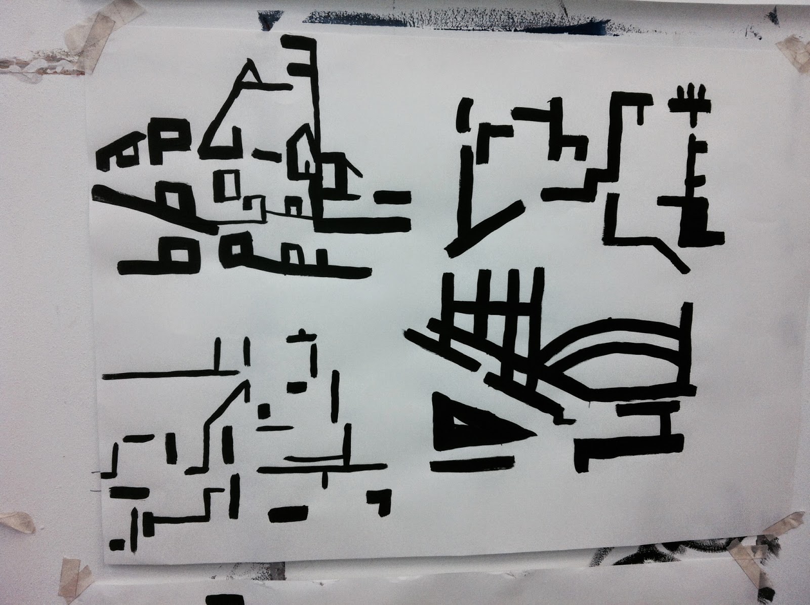
In order to move the project forward I decided to see what happened when I isolated the thick black lines from the paintings and re adjusted them around. Firstly, I directly copied these lines from my A4 paintings so that I could clearly see their composition. 


Then I decided that I wanted to cut out sections of these compositions and arrange them to see how different parts could fit together, the process was almost like doing a Jigsaw puzzle. This process is a way for further abstracting any outcomes which my come from this process. Here are some of the compositions that I came up with. I used my judgement to arrange compositions that weren't too cluttered and seemed to work. This image (first below) became the standout composition - it seems to have a flow about it which I felt lacked in some of my other compositions.


Wednesday, 5 March 2014

Paul Klee - On Modern Art


'Paul Klee - On Modern Art' with an introduction by Herbert Read
Published 1966 by Faber & Faber

I was recommended to read 'Paul Klee - On Modern Art' by my self directed tutors. Though the book's content was formulated in 1924 for a lecture delivered at the Museum in Jena, the writings are eternally relevant. Klee writes about the creative process of creating a painting, which he believes begins in the subconscious. Klee then goes on to talk about the different dimensions which artists consider while painting - line, tone, value, colour. He also discusses how subtleties in colours and lines have huge fragments of meaning - how some colours and forms work harmoniously and others create tensions. I found the book very helpful in aiding my own process of painting, in particular I have started to consider the choices I make about colour in much more depth.

Thursday, 20 February 2014

More development for Self Directed


A4 MDF Acrylic and b&w Emulsion

This was my first painting where I began thinking properly about what colours I am going to use and they way i'm going to arrange them. I moved away from applying the paint quickly and just adding the bold black lines after for a more considered way of working. The composition of this painting initially came from a photograph, but instead of trying to emulate the colours of the original I have chosen to pick out sections - or blocks - so that it gives a rather distorted but still somewhat harmonious outcome.

Wednesday, 19 February 2014

Further Self Directed Development


A4 MDF, Acrylic (All)

I have continued experimenting on a small scale with these A4 MDF paintings. I have tried studying different locations around Leicester. I am beginning to move away from using photographs and am now getting the basic colours down from life and working on them further in the studio. Some of these have worked better than others, I think this is mainly due to some locations lend themselves well to this style of painting that focuses heavily on depth, and others do not. As you can see I am still trying to create a sense of ambiguity within these paintings by adding small and subtle hints of colours.

Self Directed Development


A4 MDF Painting


For this painting I chose to use a section of a photograph of a bridge I took on the river Soar. The painting has therefore become less figurative and more of a study of line and their relationship to one another. Some of my peers saw that it resembles a birds eye view of a landscape, almost like a map. The thick bold lines I got from the zooming in process were similar to that of some of klee's later more bolder work, or Franz Kline's 'Cardinal'. I am particularly interested in the way the colours and the line unite harmoniously in 'Wald-Hexen' and the directness and speed in which Kline appears to have made his lines.


Paul Klee - Wald-Hexen 1938 99x74 cm.         Franz Kline Cardinal 1950 200x150cm


Self Directed - Intitial Paintings


A4 MDF board paintings, Acrylic

To start this self directed project I have began to explore I thread which emerged from my term 1 project where I was studying the urban environment around Leicester. I am particularly interested the varying structures that form the landscape. In my initial paintings I wanted to emphasise certain structural elements of the subject, but also to retain a sense of ambiguity to these paintings. I did this by rapidly painting the outline with a large brush and then highlighting certain sections with thick black Franz Kline-esque lines.