Showing posts with label Contextual. Show all posts

Thursday, 1 May 2014

Self Directed Canvases (and Robert Rauschenberg)


Untitled
Acrylic, White Emulsion and Collage Materials
100x100cm Canvas


Untitled
Acrylic, White Emulsion and Collage Materials
100x100cm Canvas

I decided to apply the colour/line composition onto a larger scale. I knew by this point that I had become quite bogged down in colour theory and needed to bring back some of the playfulness which was a part of my initial paintings. To do this I sought to loosen the way I applied paint, I took inspiration from Hitchens in this aspect more so than Klee, but at the same time retaining all that i'd learnt from Klee's colour theory.

First Canvas: The placement of the colours for this piece have been directly influenced by my 'colour and line' composition; though I have used a much looser approach in terms of application of paint. I used various collage items (including a piece of wood, fabric, tape, magazine paper, a slide, cardboard and the palette I used) on top of this. I chose to add collage on top to make the painting become more 3 dimensional and to add depth. I have even cut a hole in the canvas and strung fabric a few centimeters behind so that the sense of depth became even more apparent. I didn't want it to be about the objects i'd stuck on though, I wanted to implement them in a way that it keeps focus on their colour rather than objectifying them.

Second Canvas: I chose to create a composition much more loosely based on the composition ideas than I had with the first canvas. I still used some of those ideas, but I improvised and re arranged them on the canvas itself rather than before hand. I painted the lines white, so that the colours on the rest of the painting became lighter than my previous canvas - which had black lines. This shows how line and colour have an influence each other. I used collage for this piece too.

Whilst painting these canvases I became aware that certain aspects had a resemblance to some of the work of Robert Rauschenberg. I can see that it is mainly the seemingly arbitrary choice of mixed media, but with closer inspection they are there for either colour or composition reasons. My use of painted fabric could have been subconsciously influenced by Rauschenberg's 'Bed' from 1955. As you can see from his piece 'Charlene' which is one from his 'Combines' series of 1954, the whole composition is formed from found objects.

[IMG_0538.JPG]

'Bed' from 1955.

RauschenbergCharlene.jpg

Charlene, 1954, Combine painting.


Paul Klee


Paul Klee,  Maibild (May Picture), 1925. Oil on cardboard nailed to wood with original strip frame. 16 3/8 x 19 1/2 in. (41.6 x 49.5 cm)


Exercise from Paul Klee’s Colour Class, 1925

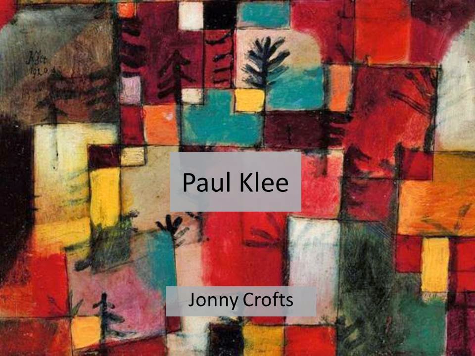
Paul Klee was a German-Swiss painter, who is considered to be one of the most highly influential figures of early 20th century Expressionism. Klee is most notable for his many abstract paintings focussing on colour and form, and his colour theory writings are considered hugely important. Klee’s art theories are well documented. In Pedagogical Sketchbook (1925), one of his several important essays on art theory, Klee tried to define and analyse the primary visual elements and the ways in which they could be applied. Klee gave a series of lectures on his colour theories at the Bauhaus between 1921 and 1931. His aim was to teach the foundations of colour and form to the students with a series of exercises. These unconventional exercises included a six-part rainbow shaped into a colour wheel. Klee set about seeking alternative ways in which to hold his paintings together visually. A benefit of utilizing small selections of colours was that the resulting impression appeared unified and harmonious. A significant aim was to translate simple colour exercise to the complex work of art.  His strategy was not only to integrate drawing and painting, but also with considerations of form, composition and content.

Klee’s visited Tunisia, where he was inspired by the colours and the light he saw there. From this experience Klee created his first abstract piece, ‘In the Style of Kairouan’. The coloured rectangles became his basic building blocks. I have been particularly interested in the way  Klee combined these blocks with a harmony which draws parallels to musical compositions. His selection of colour is very considered, using complementary pairs of colours as well as dissonant colours – much like in music where you find harmonious notes contrasted with dissonant ones. Some of Klee’s later works were noticeably darker with thick lines and fewer colours. He was diagnosed with Scleroderma, a wasting disease, in 1933. Which from therein limited his productivity as an artist. In 1937 Adolf Hitler and the Nazis deemed his work as ‘Degenerate Art’, seizing 102 of his public collection.


Ivor Hitchens


Damp Autumn (1941)
Oil on Canvas
406 x 743 mm


Ivor Hitchens (1893 -1979) was an English painter best known for being a part of the artists circle known as the 'London Group'. I was recommended to take a look at his work by my Self Directed tutors. Hitchens neither painted landscape as a detached observer, nor did he abstract forms from nature, and he valued the disciplines of Cézanne too highly to allow structure to be controlled by subjective response alone. I am particularly interested in Hitchens' use of colour - though his work lies between abstract and figurative he has used different tones to provide a sense of depth. Looking at his 1941 piece 'Damp Autumn' you can see that he has not used a wide range of colours but a limited palette with subtle changes in tone - which I think gives an effective sense of depth. Unlike much of Klee's work - another artist i'm studying - Hitchens' has applied the paint in a loose but still figurative way.

Thursday, 24 April 2014

Drawing Project Cardboard Development


Black and White Emulsion, duct tape, charcoal on corrugated cardboard
 Top 70x30cm Bottom 40x60cm

I found that paper was not suitable for the media I was using, and the was I applied it, so I opted to use Cardboard, a much more rugged material to work on top of. The textured corrugated cardboard also made for some interesting marks. I decided to continue studying Pylons and just build upon that idea, rather than diversify the subject matter because I know that Pylons lend themselves well to larger scales. Working with masking tape for my previous pieces proved effective so I experimented with Duct tape. The Duct tape provided a much deeper black than the black emulsion paint, and seems an appropriate material to use to represent the strong steel that forms the structure of the Pylons. I sought out other artists who have applied paint in this fashion, in doing so I came across Franz Kline, whose enormous black and white paintings have very direct and confident marks. 'Mahoning' from 1956 is a good example of this.


Franz Kline
'Mahoning' 1956
 Oil and paper collage on canvas, (203.2 × 254 cm).


Wednesday, 23 April 2014

Seminar Presentation - Paul Klee - Evaluation

The subject of my seminar presentation was on Painter and Art Theorist - Paul Klee. I chose him as the subject of my presentation he is an Artist who I'm studying as part of my self directed project. 

PowerPoint Presentation slides with notes:


  • Paul Klee was a German-Swiss painter, who is considered to be one of the most highly influential figures of early 20th century Expressionism.
  • Klee is most notable for his many abstract paintings focussing on colour and form, and his colour theory writings are considered hugely important.


  • Klee’s art theories are well documented. In Pedagogical Sketchbook (1925), one of his several important essays on art theory, Klee tried to define and analyse the primary visual elements and the ways in which they could be applied.
  • Klee gave a series of lectures on his colour theories at the Bauhaus between 1921 and 1931. His aim was to teach the foundations of colour and form to the students with a series of exercises. These unconventional exercises included a six-part rainbow shaped into a colour wheel. Klee set about seeking alternative ways in which to hold his paintings together visually. A benefit of utilizing small selections of colours was that the resulting impression appeared unified and harmonious. A significant aim was to translate simple colour exercise to the complex work of art.  His strategy was not only to integrate drawing and painting, but also with considerations of form, composition and content.


  •  Klee’s visited Tunisia, where he was inspired by the colours and the light he saw there. From this experience Klee created his first abstract piece, ‘In the Style of Kairouan’. The coloured rectangles became his basic building blocks.  Klee combined these blocks with a harmony which draws parallels to musical compositions. His selection of colour is very considered, using complementary pairs of colours as well as dissonant colours – much like in music where you find harmonious notes contrasted with dissonant ones.


  • Some of Klee’s later works were noticeably darker with thick lines and fewer colours. He was diagnosed with Scleroderma, a wasting disease, in 1933. Which from therein limited his productivity as an artist.
  • In 1937 Adolf Hitler and the Nazis deemed his work as ‘Degenerate Art’, seizing 102 of his public collection.


  • Here I have embedded a YouTube Video, which gives a tour of a few Klee paintings in the Tate.


  •  I finished the presentation with two of my pieces of work from my self directed project. I talked about how Klee's work and practice has influence mine.


Feedback forms

My tutor and two of my peers completed these feedback forms about my presentation.


Evaluation

I will evaluate my presentation with my Tutor and Peer feedback considered.

Strengths

The presentation was clear in terms of the way I spoke and the layout of the images and text on the slides. I had a good variety of images that were of a high resolution, so they were easy to see. Another strength was that I explained some of Klee's theories and how he had documented these, as well as how he himself had been influenced. I put Klee into context with his contemporaries and colleagues such as Wassily Kandinsky the the Bauhaus. The historical context where I talked about how the Nazi's labelled his work as degenerate which discussed was also noted as a strength. I explained how this suppression impacted Klee's painting style, as well as his wasting disease. I embedded my YouTube clip into the PowerPoint, which meant I didn't waste any time finding the video in the browser - this is also a much more professional way of showing a video. The video itself helped back up some of the things I was saying, as well as expanding on some of my points and giving more examples of his work. I made sure that I presented with a clear voice at a volume that projected to the people at the back of the room.

Weaknesses

It was brought up in the feedback that the presentation as a whole was too descriptive, and that it needed to include more of my own thoughts about his work. I should have spent more time discussing how my own work has been influenced by his. Another weakness was that I did not have a written, or a least scripted comparison of mine and Klee's work to present, so I just spoke without having prepared anything.

Overall I believe my presentation was largely a success, which conveyed Klee's paintings and theories concisely. However, if I were to enter a time machine and re-do the presentation I would integrate images of my own work within the body of the presentation so that I could discuss the relationship between mine and Klee's work - this would mean I could talk about how his work has had an influence on mine. Lastly, I would make sure that I have prepared notes for parts where I talk about my own work.


Wednesday, 5 March 2014

Paul Klee - On Modern Art


'Paul Klee - On Modern Art' with an introduction by Herbert Read
Published 1966 by Faber & Faber

I was recommended to read 'Paul Klee - On Modern Art' by my self directed tutors. Though the book's content was formulated in 1924 for a lecture delivered at the Museum in Jena, the writings are eternally relevant. Klee writes about the creative process of creating a painting, which he believes begins in the subconscious. Klee then goes on to talk about the different dimensions which artists consider while painting - line, tone, value, colour. He also discusses how subtleties in colours and lines have huge fragments of meaning - how some colours and forms work harmoniously and others create tensions. I found the book very helpful in aiding my own process of painting, in particular I have started to consider the choices I make about colour in much more depth.

Wednesday, 19 February 2014

Self Directed Development


A4 MDF Painting


For this painting I chose to use a section of a photograph of a bridge I took on the river Soar. The painting has therefore become less figurative and more of a study of line and their relationship to one another. Some of my peers saw that it resembles a birds eye view of a landscape, almost like a map. The thick bold lines I got from the zooming in process were similar to that of some of klee's later more bolder work, or Franz Kline's 'Cardinal'. I am particularly interested in the way the colours and the line unite harmoniously in 'Wald-Hexen' and the directness and speed in which Kline appears to have made his lines.


Paul Klee - Wald-Hexen 1938 99x74 cm.         Franz Kline Cardinal 1950 200x150cm


Friday, 3 January 2014

Frank Stella


Frank Stella - Untitled 1967
From Black Series
Lithograph on Paper

Frank Stella is an American artist born in Massachusetts in 1936. I began looking at Frank Stella's Black Series, particularly his use of lines. The first thing that strikes me about the lines is how you can see that they have been done without the use of a ruler, as you can see that there are slight imperfections. It is thought that Stella chose to do this as a nod to the Abstract Expressionism which was prominent at the time.  


John Virtue


John Virtue, London Paintings Series, 2005.

Shellac Black ink, White paint on Canvas.


John Virtue is a English painter who is well known for using a monochrome colour pallet. In his paintings you can see that there are glimpses of of buildings in the background amongst the chaos, this is something which I would like to incorporate in my own paintings. I think this gives a sense of ambiguity to the paintings, leaving you trying to work out what the painting is all about.


Henri Michaux


Henri Michaux was a Belgian-born French poet and artist. He spent most of his time doing poetry, and saw drawing and painting as 'a release from words'. The piece that I studies was an untitled Ink Drawing From 1963, which I saw in the Tate Modern gallery in London. I think the marks look like Calligraphy in a way, which is no coincidence as he created his own alphabet in 1927, as well as doing a lot of writing with his poetry. He used sticks to drag the ink repeatedly across the surface, he described this style as "Nothing but rhythm" and that he was "fighting with the blots". During the time of this painting he experimented with the drug 'Mescalin' which has similar affects to LSD. The results were very obsessive and detailed, as you can see it sways upwards, kind of like when you write without looking at the page. The exhibition catalog from 1968 read "Finally liberated from language, Michaux would throw, blow and drag ink around the paper, releasing his inner turmoil". He was a troubled man, his wife died in 1948 and he suffered from Anorexia, which could have kick-started his drug use.

Sunday, 1 December 2013

Richard Wilson - 20:50

                                         Richard Wilson, 20:50
Richard Wilson is a British Born sculptor, whose work I saw at my recent visit to the Saatchi Gallery on the London Trip. His site specific installation '20:50' gives the impression that the room is filled with oil, though it is just a few inches deep. It seems to me that Wilson really played with the idea of space and density.

Michael Johansson


Recollecting Koganecho, 2012


Dawn, 2013
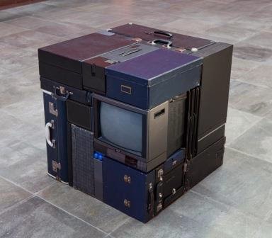
Michael Johansson is a Swedish artist who creates large scale installations using household items. I came across Johansson while searching for sculptors whose work was like the words 'Dense' and 'Made'. To me his work is about filling a designated space a forcing the air from it. The items he uses are quite arbitrary, though there is some thought into the aesthetics of each item. As you can see in 'Dawn' the choice in colours is limited to blue hues.