
Untitled
Acrylic, White Emulsion and Collage Materials
100x100cm Canvas

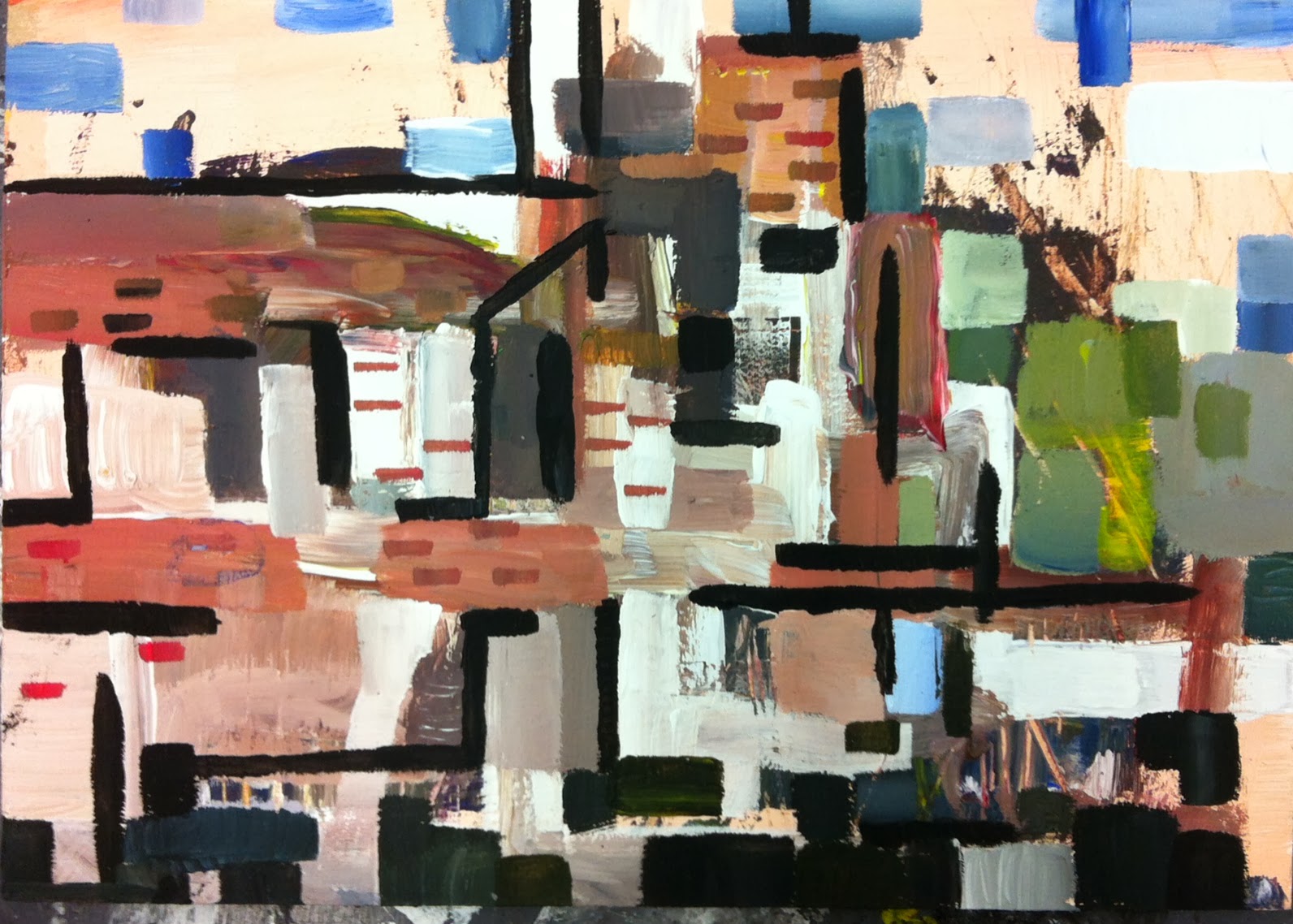
Untitled
Acrylic, White Emulsion and Collage Materials
100x100cm Canvas
I decided to apply the colour/line composition onto a larger scale. I knew by this point that I had become quite bogged down in colour theory and needed to bring back some of the playfulness which was a part of my initial paintings. To do this I sought to loosen the way I applied paint, I took inspiration from Hitchens in this aspect more so than Klee, but at the same time retaining all that i'd learnt from Klee's colour theory.
Second Canvas: I chose to create a composition much more loosely based on the composition ideas than I had with the first canvas. I still used some of those ideas, but I improvised and re arranged them on the canvas itself rather than before hand. I painted the lines white, so that the colours on the rest of the painting became lighter than my previous canvas - which had black lines. This shows how line and colour have an influence each other. I used collage for this piece too.
Whilst painting these canvases I became aware that certain aspects had a resemblance to some of the work of Robert Rauschenberg. I can see that it is mainly the seemingly arbitrary choice of mixed media, but with closer inspection they are there for either colour or composition reasons. My use of painted fabric could have been subconsciously influenced by Rauschenberg's 'Bed' from 1955. As you can see from his piece 'Charlene' which is one from his 'Combines' series of 1954, the whole composition is formed from found objects.
![[IMG_0538.JPG]](https://blogger.googleusercontent.com/img/b/R29vZ2xl/AVvXsEjNPkoI_L8hvzyUdc5fP9K27qj5BBFu2wweHYCjapSRQ8rjolrxVvgFKgYWKlVLMtpEdv6UPFVJeh40AOlYtBS3IoH1WVSHZFbQco_j3tSpydHu5CnNbISL7zj2uzQLmPSzsexAm9ESNp4/s400/IMG_0538.JPG)
'Bed' from 1955.

Charlene, 1954, Combine painting.


.jpeg)


.jpeg)


.jpeg)
.jpeg)
.jpeg)
.jpeg)
.jpeg)